

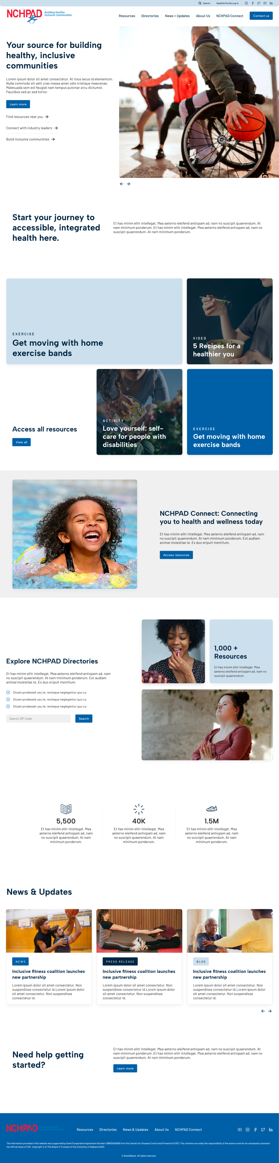
Access for All Abilities
NCHPAD (National Center on Health, Physical Activity and Disability) is nationally known as the first stop for videos, articles, research and programs that aim to advance a fully inclusive society. The only problem? Users were stuck wandering around in the “stacks” of this vast library with a limited ability to find specific resources or discover something new. With this website design, I reimagined NCHPAD’s entire content taxonomy and built a new, user-centered dashboard to make finding and sharing content easier than ever.
The Problem
As a 24-year-old organization, NCHPAD had thousands of resources from different initiatives and funding cycles that had been added to the site without a true organizing hierarchy. The result: a website where certain articles rose to the top, but other great content was buried or lacked a tactile path to its location. In fact, it was nearly impossible to identify whether the research article about Down Syndrome was meant for healthcare providers or those with Down Syndrome who were looking for more information.
Role: Lead Designer
Areas: Information Architecture + Design
Additionally, with 14K monthly visitors, NCHPAD not only had a content management crisis, but also a crisis of brand identity. Without adequate space dedicated to the NCHPAD backstory, it was difficult to facilitate buy-in for new users.
Platforms: Desktop + Mobile

Research Methods
Taxonomy Investigation and Cataloging
Need to better understand not only quantity of resources, but also type and categorization
Why?
To improve discoverability and findability
Google Analytics
Compared user behavior flows and traffic
Why?
Track user behavior and verify pathways to content
Research Insights
Research revealed that users were consistently relying on the search bar to find content, instead of organically navigating between pages. Frequent visits to the “About Us” page, which only contained one paragraph of information, also revealed that users were struggling to form a coherent picture of the brand’s identity.
Opportunities
Simplify user flows
Give users a centralized entry point into NCHPAD offerings in a way that mimics the organization’s internal structure without getting bogged down with jargon.
Empower users through taxonomy
Build and maintain a user-centered hierarchy that will be the driving force behind the categorization of resources on the site.
Templatize content
Content templatized by type will not only facilitate production, but help users build a mental model for site resources
Solutions
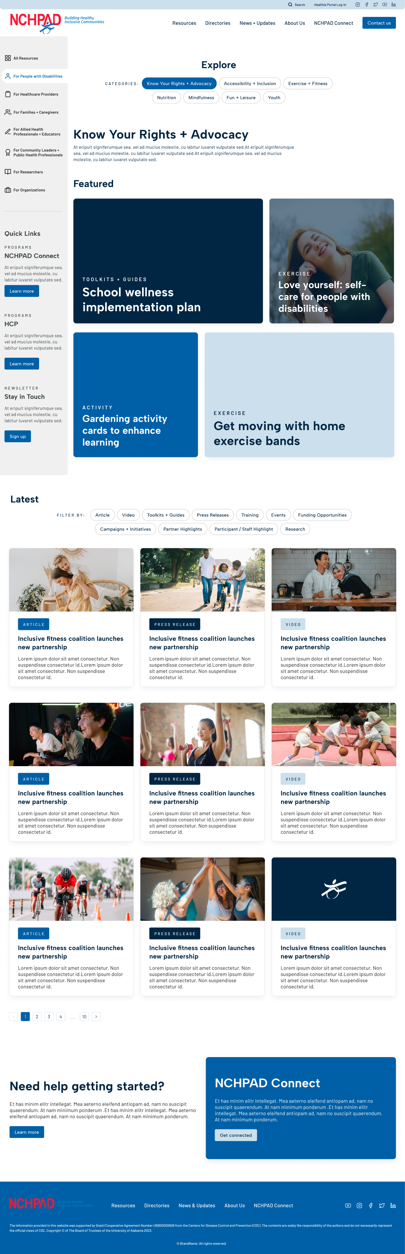
01: Personalized Dashboard
To increase discoverability, I designed a resource dashboard that encourages users to self-identify in order to find content. The fixed sidebar lets users know there is more content to see, but lessens some of the noise around thousands of articles with no identifying structure. Instead of a large bucket, users instead can filter down slowly, diving deeper into interests and finding related content. The dashboard model also encourages a sense of ownership over resources. This gives users the sense that the content has been specifically tailored to their needs, which enhances trust that people have in this decades-old brand.

How I’m meeting goals
Custom-styled dashboard with relevant content categories
What I’m thinking about
How can we make sure users are finding the right content?
How can we make the amount of resources feel less overwhelming?

02: Updated Navigation
After sifting through the site’s entire content catalog, I developed and conducted an audit, reclassifying resources to identify patterns in content category and type. Pulling from these larger categories, I then restructured the site’s navigation, utilizing user groups as the first point of grouping.
From there, I parsed out different relevant categories, cross-referencing them with most-searched articles. Finally, I assigned each piece of content a type to facilitate better discoverability and allow our dev team to build dynamic related resources on each page.
What I’m thinking about
How can we make content easier to find?
How can we make sure users discover more of the content NCHPAD has to offer?
How I’m meeting goals
Site audit and content map
Restructured mega menu with user-first categorization

03: Powerful and Intuitive Navigation
After sifting through the site’s entire content catalog, I developed and conducted an audit, reclassifying resources to identify patterns in content category and type. Pulling from these larger categories, I then restructured the site’s navigation, utilizing user groups as the first point of grouping.
From there, I parsed out different relevant categories, cross-referencing them with most-searched articles. Finally, I assigned each piece of content a type to facilitate better discoverability and allow our dev team to build dynamic related resources on each page.
What I’m thinking about
How can we make content easier to find?
How can we make sure users discover more of the content NCHPAD has to offer?
How I’m meeting goals
Site audit and content map
Restructured mega menu with user-first categorization
Iterations
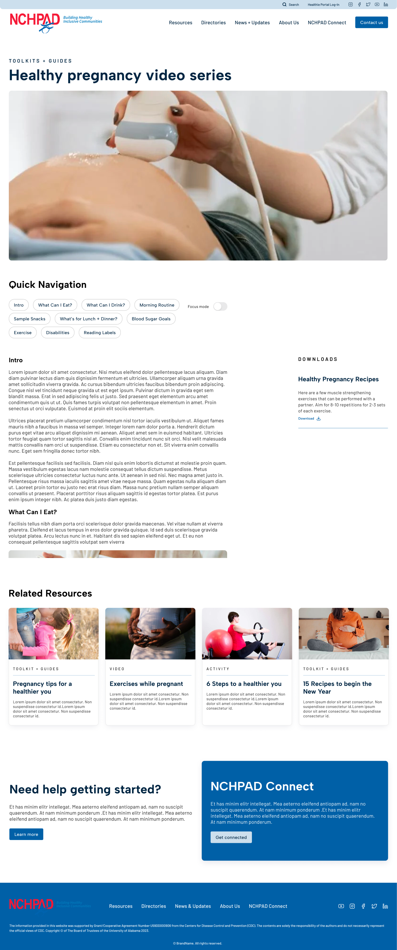
01: Purpose-Built Pages
When planning individual pages for each piece of content, I wanted to build distinct templates to promote accessibility and to give the user visual cues that the information differed in purpose. However, creating tons of different templates would be difficult on the developer, who would have to create multiple custom post-types on the back end.
Instead, I simplified and figured out the maximum number of templates that I needed. To make dev easier, I simply rotated the placement of downloads and related resources depending on if they were needed or relevant. For example, a category like research, needed a column that housed publication information instead of downloads.
I reasoned that if another goal of mine was to amplify the accessibility of all pages, I could also add a focus mode and a quick nav bar that divided long articles into shorter chunks of text.

What I changed
Added distinct page attributes based on page type: downloads, publication info, related resources etc.
Added “focus mode” and quick navigation anchor links
How changes benefit users
Helps build a mental model of different content types
Facilitates easy reading and consumption of materials
What I tested
Do traditional pages of content with long blocks of text really work for this user group?
Is there a way to increase accessibility and reduce friction for users without making the pages a nightmare to develop?

Learnings
When handling such a large amount of content, I saw how important it was for our team to be organized and to start thinking about our content strategy right away. For a lot of clients, content import and organization tends to be something that is on the back burner, and when it’s time to launch the site, it can be a source of friction for teams to sort out.
By guiding clients with this audit, I was able to circumvent those growing pains and build a site that had a solid foundation of categorization that will allow users to fall into and out of as many content “rabbit holes” as they please.