Client-First Behavioral Healthcare
As one of Washington’s largest and fastest growing behavioral healthcare providers, Compass Health needed a better way to connect clients with care while sharing updates with the community at large. With a revamped navigation structure and user pathways, clients and shareholders alike now get the information they need at the right place and the right time.
The Problem
Compass Health does a lot for the community it serves, so much so that its old website could barely contain its growing list of services. Inundated with acronyms and multi-step navigation, clients got lost in a long, complicated menu that often didn’t lead them to the right place: where they could go to access care.
Role: Lead Designer
Areas: Strategy + Design
In recent years, Compass Health also became a larger player in the behavioral healthcare space. With more political muscle, the organization needed a way to speak to a diverse group of stakeholders: lobbyists, community leaders, and neighbors. There was a story to tell, but like clients on the site, these audiences were also lost.
Platforms: Desktop + Mobile


Research Methods
Closed card sort
Prepared different groupings of service categories
Why?
Determine what aligned with the team’s mental models, simplifying navigation
Google Analytics
Compared user behavior flows and traffic
Why?
To track users’ paths throughout the site and to determine how many users were going back to previous pages because they couldn’t find what they were looking for
Research Insights
Research revealed that user behavior was a bit strange: clients would return back to previous pages consistently, suggesting that they were having trouble finding what they needed to find. With an average of only a minute spent on each page, I wanted to make sure that relevant information was easy to find, and the key to doing that was developing a new user flow through the navigation.
Opportunities
Increase access
Instead of navigating back and forth on the site, I could give users a clear path forward from finding the right service to actually receiving care.
Localize content
With pages purpose-built for key audiences, I could make sure stakeholders were receiving the right message at the right time.
Improve site administration
By improving navigation and user flows, I could also just as importantly improve site administration on the backend, making sure the Compass Health team had a quick way to update service information site wide.
Solutions
01: Sign-posting Services
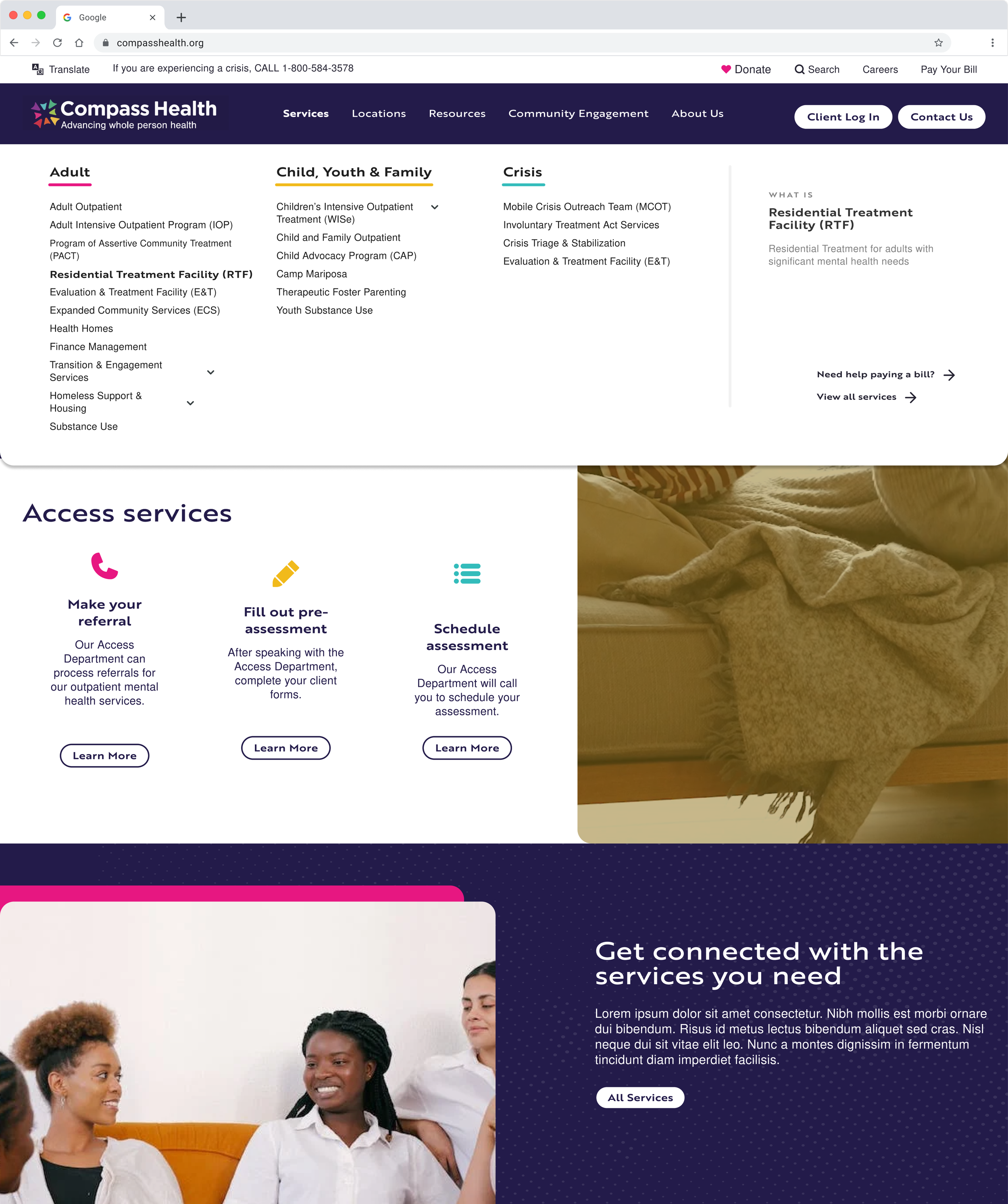
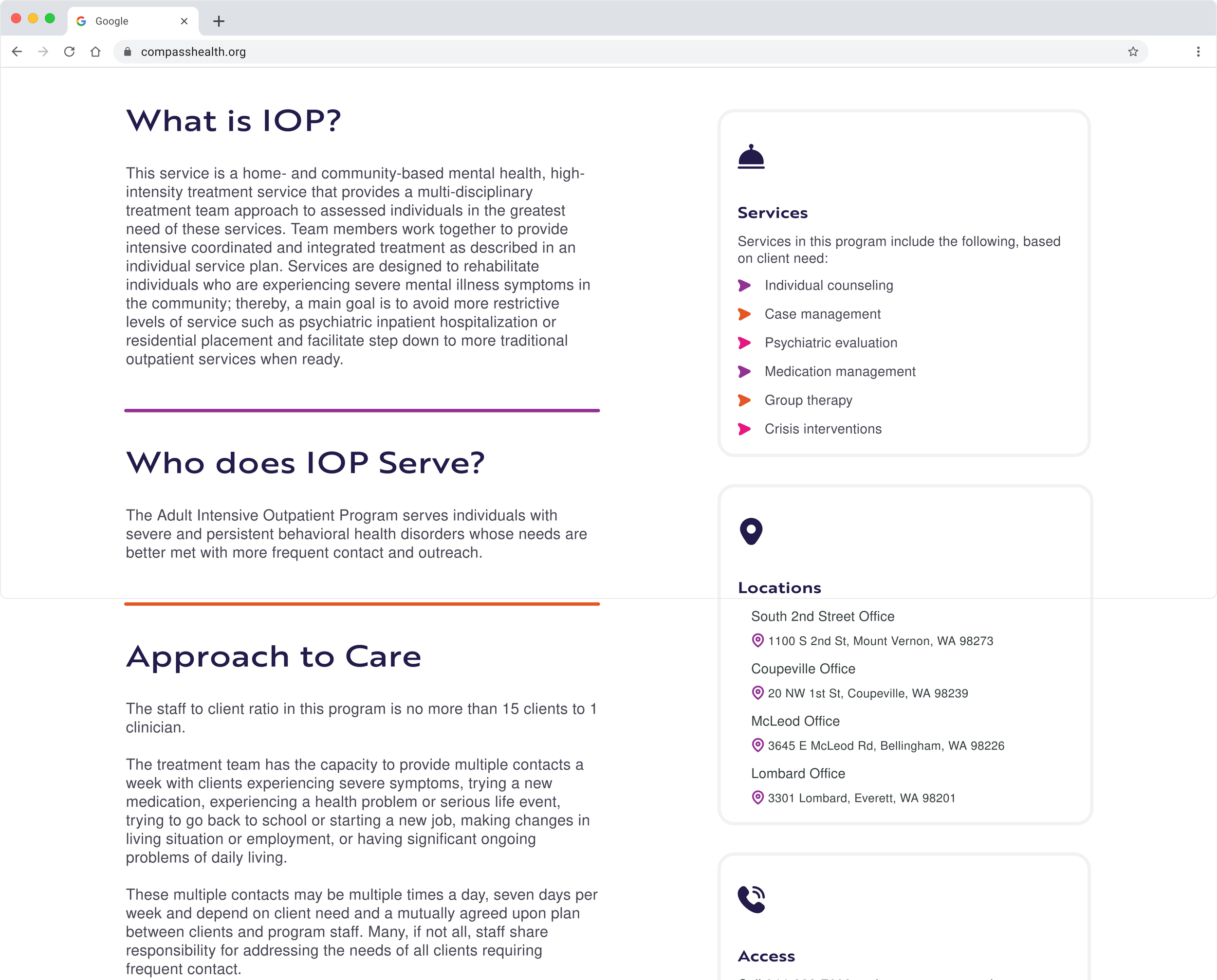
I built a new navigation that empowers users to self-identify - leading them to the right services. Within the navigation, a hover state that translates from desktop to mobile allows users to begin to understand the Compass Health world and all of the acronyms associated with the healthcare space. Finally, a templatized individual service page spells out exactly what users should expect when receiving care.
How I’m meeting goals
New menu broken down by self-identified groups
New services page that work off a template, reducing friction and building mental models
What I’m thinking about
How can we make sure users end up in the right spot every time?
How can we reduce decision making?
02: Stakeholder Power
Custom-built landing pages for key projects and community-centered work allows Compass Health to earn buy-in from different groups of stakeholders. Separating this out in the navigation mirrors internal structures, and builds a strong sense of identity among team members.
What I’m thinking about
How can we ensure that different groups are getting curated stories?
How can we make relevant landing pages for all of the community and statewide work?
How I’m meeting goals
Purpose-built landing pages that cross-link to other important CTAs like donations, major gifts and lobbying agendas.
Iterations
01: Sign-posting Services
When building locations, I was faced with a range of options for tackling an unwieldy list of places to access care. The main problem: users couldn’t just select a location closest to them to receive treatment. Compass Health facilities are specialized, meaning some services are offered in certain areas but not others.
So how was I supposed to get clients to the right place? Instead of a list of locations, I filtered information step by step, asking users to identify their service first, before directing them to the closest area that offered treatment.
What I changed
Service-first identification that then reveals appropriate locations for users to select.
How Changes benefit users
No more rerouting or having to explain the complexities of why services are offered at one location and not the other
One, straight forward path that gives the users rails to make sure they get to the right place.
What I tested
How does a list of locations with directions inhibit or help users get to the right place
Are users getting too much information at once?
Is that why they’re feeling frustrated that services aren’t offered at locations closest to them?
Learnings
When working with a complex organization like a behavioral healthcare provider, balancing the needs of the internal team with the needs of clients is a complex task. Coupled with the real-world impact of ensuring appropriate care for acute behavioral health symptoms, I needed to ensure the website was the centerpiece of a well-rounded system of care.
Now, with the ability to quickly direct users to salient information, the 54% increase in site visitors post launch and an increased engagement time of 30s per engaged user, points to evidence that clients are finding critical information when they need it most.


