

Educational Matters
American Board was founded in 2001 by the U.S. Department of Education to offer a path for professionals to start a career in education. Despite offering the flexibility of an accessible and self-paced online learning system, American Board struggled to differentiate itself from competitors while ensuring users understood the ins and outs of the program.
The Problem
One of the big issues on the American Board site was actually its fixation on sales. Because of this, the messaging and user flows became circuitous – always encouraging users to “enroll now.”
Role: Lead Designer
Areas: Strategy + Design
The problem? American Board was sacrificing usability and brand messaging for the sake of perceived ROI. In fact, the pathways from their Google Analytics suggested people were bouncing between pages without actually converting. Without proof of concept, people weren’t convinced to become teachers at all.
Platforms: Desktop + Mobile


Research Methods
Competitor Audit
Prepared spread sheet documenting differences and similarities
Why?
Compare brand messaging and usability of similar websites to better understand industry standards.
Google Analytics
Compared user behavior flows and traffic
Why?
Establish user pathways and validate lack of conversions and the circuitous nature of the navigation.
Research Insights
Research revealed that users were constantly cycling among the more explanatory pages that detailed enrollment requirements and subject features – all of which differed depending on the state. However, at the end of this loop, American Board didn’t have the amount of conversions it expected. I wanted to make sure that users' expectations were met at the outset by diving deep into the American Board story and aligning it with users' mental models.
Opportunities
New user flows
Instead of forcing users to toggle between the same pages, I could give them a clear path forward, leading to conversions for American Board.
Clear brand story
Build identifying characteristics that separate American Board from its competitors, matching the organization’s overall goals and values.
Facilitate buy-in
Create at-a-glance-content that offers real world examples of users who have used and benefited from the American Board program
Solutions
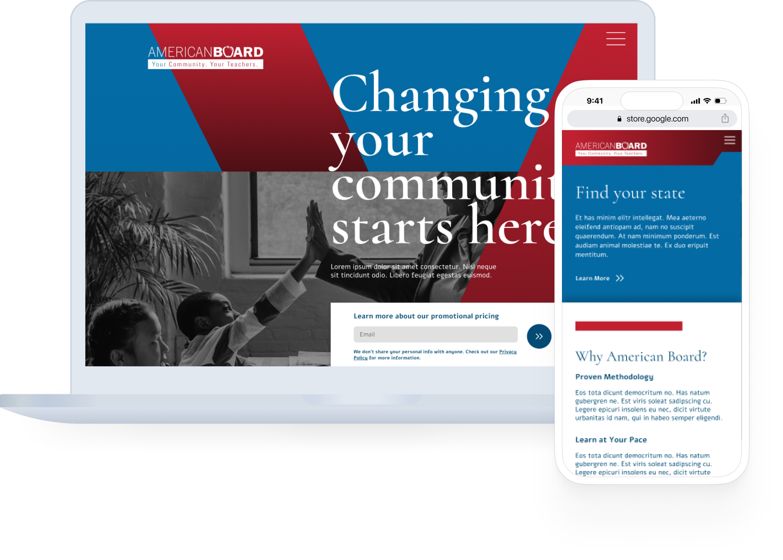
01: Clear path forward
First, I redesigned the menu to reduce friction and give users one path forward to the correct information about their state and subject requirements. This lessened the likelihood that users would get lost or would be clicking aimlessly within the same content loop.

How I’m meeting goals
New menu structure with singular path forward
Templated pages link together without overwhelming user with information
What I’m thinking about
How can we make sure users find what they’re looking for without getting overwhelmed with information?'
How can a singular user flow actually increase conversions?

02: Designing with story in mind
Because everything on American Board’s site was focused on “enrolling now” users were left with very few pieces of information about why they should pick American Board or how this program differentiated from others. As part of the larger brand redesign, I focused on ideating pages that spelled out value-building offerings. These, and custom page blocks that showed materials, provided testimonials and explained partnerships, encouraged a deeper delve into the brand story that went beyond surface-level clicks.
What I’m thinking about
How can I tell the American Board story?
How can I use storytelling as a way to build brand trust and increase ROI?
How I’m meeting goals
Custom page blocks inspired by real people’s stories
Clear direction on pages that blends brand building and KPIs
03: Elevating visual language
One of the final pieces of building the American Board brand was to ensure that the visual brand matched the organization’s goals and offerings. In a saturated marketplace, American Board is the only program backed by the U.S. Department of Education and the only one that emphasizes a low-cost approach to education. An elevated style with bold, graphic elements reinforced the integrity of American Board’s accreditation and helped position it as a leader among competitors.

How I’m meeting goals
New graphic language and design
Updated aesthetic direction that mimics impact of noteworthy accreditation background
What I’m thinking about
How can I marry the ease and flexibility of the program while building trust?
Iterations
01: Where’s my state?
When building out the menu for this project, I had to course correct to factor in American Board’s growing list of states that offer educational programs.
Because the system wasn’t offered statewide, I didn’t want users to have to chance upon an explanation for why their state wasn’t displayed in the menu – I needed to make sure that this scenario had a specific flow.
Instead of just using a simple text box on the bottom of the home page, or other state pages, I built out a landing page called “Where's My State?” to make this scenario less of an “unhappy path” and to reinforce another opportunity for American Board to build trust with the user.

What I changed
Built a specific landing page to reroute users and to provide at-a-glance information
How changes benefit users
Decreases the chance that users are confused.
Gives opportunity to solidify brand attitudes and perception.
What I tested
Can simple text boxes or FAQs could answer this question for users without causing too much friction?
Learnings
The equal effort given to branding and user flows was an interesting lesson in marrying business and user goals. For this project, it was important that the American Board brand and its users both had seats at the table in order to develop a successful site. With new visual differentiators and improved navigation, the site encourages a clear path to conversion without sacrificing story.